轮廓半径?
无论如何在div element的大纲上获得圆角,类似于border-radius?
21 个答案:
答案 0 :(得分:442)
现在有一个老问题,但这可能与有类似问题的人有关。我有一个圆角border的输入字段,想要改变焦点轮廓的颜色。我无法将可怕的方格outline驯服到输入控件。
相反,我使用了box-shadow。我实际上更喜欢阴影的光滑外观,但阴影可以硬化以模拟圆形轮廓:
/* Smooth outline with box-shadow: */
input[type=text]:focus {
    box-shadow: 0 0 3pt 2pt red;
}

/* Hard "outline" with box-shadow: */
input[type=text]:focus {
    box-shadow: 0 0 0 2pt red;
}
答案 1 :(得分:70)
我通常使用:after伪元素完成此操作: http://jsfiddle.net/6QUhf/
当然它取决于用法,这种方法允许控制单个边框,而不是使用硬阴影方法。
你也可以设置-1px偏移并再次使用背景线性渐变(无边框)来获得不同的效果。
a {
    background: #999;
    padding: 10px 20px;
    border-radius: 5px;
    text-decoration: none;
    color: #fff;
    position: relative;
    border: 2px solid #000;
}

a:after {
    content: '';
    display: block;
    position: absolute;
    top: 0;
    bottom: 0;
    left: 0;
    right: 0;
    border-radius: 5px;
    border: 2px solid #ccc;
}
答案 2 :(得分:28)
与上面的Lea Hayes类似,但这是我如何做到的:
div {
  background: #999;
  height: 100px;
  width: 200px;
  border: #999 solid 1px;
  border-radius:10px;
  margin: 15px;
  box-shadow: 0px 0px 0px 1px #fff inset;
}
不需要嵌套DIV或jQuery,为简洁起见,我遗漏了一些CSS的-moz和-webkit变种。您可以在http://jsfiddle.net/Zq8XU/
看到结果答案 3 :(得分:17)
我想你正在寻找something like this。
div {
    -webkit-border-radius: 10px;
    -moz-border-radius: 10px;
    border-radius: 10px;
    border: 1px solid black;
    background-color: #CCC;
    height: 100px;
    width: 160px;
}
修改
只有Firefox -moz-outline-radius正常,但这不适用于IE / Chrome / Safari / Opera /等。因此,看起来最像跨浏览器兼容的方式 * 来获取边框周围的曲线是使用包装器div:
HTML
<div class="outer"><div class="inner"></div></div>
CSS
div.inner {
    -webkit-border-radius: 10px;
    -moz-border-radius: 10px;
    border-radius: 10px;
    border: 1px solid black;
    background-color: #CCC;
    height: 100px;
    width: 160px;
}

div.outer {
    display: inline-block;
    -webkit-border-radius: 10px;
    -moz-border-radius: 10px;
    border-radius: 10px;
    border: 1px solid red;
}
除了使用图像
*
答案 4 :(得分:14)
我想在Bootstrap导航栏中为下拉菜单提供一些很好的焦点可访问性,并对此非常满意:
 a.dropdown-toggle:focus {
     display: inline-block;
     box-shadow: 0 0 0 2px #88b8ff;
     border-radius: 2px;
 }
答案 5 :(得分:13)
通过将outline-style: auto设置在WebKits雷达上,我们可能很快就会看到我们的愿望:http://trac.webkit.org/changeset/198062/webkit
再见2030年。
答案 6 :(得分:8)
我刚刚为此找到了一个很好的解决方案,在查看到目前为止的所有回复后,我还没有看到它发布。所以,这就是我的所作所为:
我为类创建了一个CSS规则,并为该规则使用了一个伪类:focus。我设置outline: none以摆脱那个默认的浅蓝色非边界半径的轮廓&#39; Chrome默认使用。然后,在同一个:focus伪类中,该轮廓不再存在,我添加了我的半径和边框属性。通向以下
outline: none;
border-radius: 5px;
border: 2px solid maroon;
有一个带有边框半径的栗色轮廓,当用户选中该元素时,该轮廓现在会出现。
答案 7 :(得分:8)
使用这个:
阴影框:0px 0px 0px 1px red;
答案 8 :(得分:6)
Firefox 88+:边界半径
从 2021 年 4 月起,您将能够为 Firefox 使用简单的 CSS:
.actual {
outline: solid red;
border-radius: 10px;
}
.expected {
border: solid red;
border-radius: 10px;
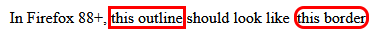
}In Firefox 88+,
<span class="actual">this outline</span>
should look like
<span class="expected">this border</span>Firefox 86.0 中的当前行为:
Webkit:没有解决方案
使用 outline-style: auto 将告诉«用户代理渲染自定义轮廓样式»:参见 [MDN](https://developer.mozilla.org/en-US/docs/Web/CSS/outline-风格(.
当您使用 outline-style: auto 时,基于 Webkit 的浏览器将在边框上绘制轮廓。很难对其进行适当的样式设置。
.actual {
  outline: auto red;
  border-radius: 10px;
}

.expected {
  border: solid red;
  border-radius: 10px;
}
In WebKit browsers (Chrome, Edge),
<span class="actual">this outline</span>
should look close to
<span class="expected">this border</span>Chrome 89.0 中的当前行为:

更多信息
从 Firefox 88(即将发布 April 20 2021)开始,轮廓将遵循边界半径的形状。
当前的 -moz-outline-radius 将变得多余并被删除。
见MDN's entry about -moz-outline-radius:
从 Firefox 88 开始,标准的轮廓属性将遵循 border-radius 的形状,使得 -moz-outline-radius 属性变得多余。因此,此属性将被删除。
答案 9 :(得分:5)
我知道他的意思......
如果你想要一个浮雕外观你可以做类似以下的事情:
他正在寻找一种在其他浏览器中使用这种方法的方法..没有我找到的解决办法,但是其他人有什么工作吗?
编辑:唯一可以做到这一点的方法就是使用box-shadow,但如果你已经在该元素上有一个方框阴影,那么这个方法就不行了。
答案 10 :(得分:4)
据我所知,self仅受Firefox和Firefox for Android支持。
message_handler 
答案 11 :(得分:2)
没有。边框位于元素的外侧和框模型边缘区域的内侧。轮廓位于元素的内部,框模型填充区域忽略它。它不是为了美学。这只是向设计师展示元素的轮廓。例如,在开发html文档的早期阶段,开发人员可能需要快速辨别出是否已将所有骨架div放在正确的位置。稍后他们可能需要检查各种按钮和表格是否是彼此分开的正确像素数。
边界本质上是美学的。与轮廓不同,它们实际上是盒子模型的一部分,这意味着它们不会与设置为边距的文本重叠:0;边框的每一面都可以单独设计。
如果您尝试将角半径应用于轮廓,我假设您正在使用大多数人使用边框的方式。所以,如果你不介意我问,轮廓的哪些属性使它更适合边界?
答案 12 :(得分:2)
如果您只需要没有边框的轮廓,则有解决方案。不是我的。我从Bootstrap css文件得到了。如果指定outline: 1px auto certain_color,您将获得特定颜色div周围的细线外线。在这种情况下,指定的宽度无关紧要,即使您指定10 px宽度,无论如何它都是细线。上述规则中的关键词是“auto”
如果您需要具有圆角和特定宽度的轮廓,则可以在边框上添加具有所需宽度和相同颜色的css规则。它使轮廓更厚。
答案 13 :(得分:2)
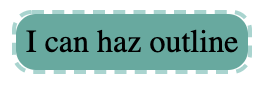
正如其他人所说,只有Firefox支持。这是一种解决方法,可以执行相同的操作,甚至可以使用虚线轮廓。
.has-outline {
    display: inline-block;
    background: #51ab9f;
    border-radius: 10px;
    padding: 5px;
    position: relative;
}
.has-outline:after {
  border-radius: 10px;
  padding: 5px;
  border: 2px dashed #9dd5cf;
  position: absolute;
  content: '';
  top: -2px;
  left: -2px;
  bottom: -2px;
  right: -2px;
}
<div class="has-outline">
I can haz outline
</div>
答案 14 :(得分:1)
我正在制作自定义单选按钮,我发现最好的自定义方式是使用如下伪元素:Codepen
/*CSS is compiled from SCSS*/

.product-colors {
  margin-bottom: 1em;
  display: flex;
  align-items: center;
}
.product-colors label {
  position: relative;
  width: 2.1em;
  height: 2.1em;
  margin-right: 0.8em;
  cursor: pointer;
}
.product-colors label:before {
  opacity: 0;
  width: inherit;
  height: inherit;
  padding: 2px;
  border: 2px solid red;
  border-radius: 0.2em;
  content: "";
  position: absolute;
  z-index: 1;
  background: transparent;
  top: -4px;
  left: -4px;
}
.product-colors input {
  position: absolute;
  opacity: 0;
  width: 0;
  height: 0;
}
.product-colors input:checked + label:before, .product-colors input:focus + label:before {
  opacity: 1;
}
<div class="product-colors">
<input type="radio" name="cs" id="cs1" value="black">
<label for="cs1" style="background:black"></label>
<input type="radio" name="cs" id="cs2" value="green">
<label for="cs2" style="background:green"></label>
<input type="radio" name="cs" id="cs3" value="blue">
<label for="cs3" style="background:blue"></label>
<input type="radio" name="cs" id="cs4" value="yellow">
<label for="cs4" style="background:yellow"></label>
</div>答案 15 :(得分:1)
组合框阴影和轮廓。
对Lea Hayes的回答略有不同 我发现
input[type=text]:focus {
    box-shadow: 0 0 0 1pt red;
    outline-width: 1px;
    outline-color: red;
}
获得非常好的清洁效果。使用边框半径时不会出现大小变化
答案 16 :(得分:0)
基本问题的简单答案是“否”。唯一的跨浏览器选项是创建可实现所需功能的hack。 在设计现有内容的样式时,此方法确实带来了一些潜在的问题,但与许多其他解决方案相比,它提供了更多的轮廓自定义设置(偏移,宽度,线条样式)。
在基本层面上,请考虑以下静态示例(运行示例片段):
.outline {
    border: 2px dotted transparent;
    border-radius: 5px;
    display: inline-block;
    padding: 2px;
    margin: -4px;
}

/* :focus-within does not work in Edge or IE */
.outline:focus-within, .outline.edge {
    border-color: blue;
}

br {
    margin-bottom: 0.75rem;
}
<h3>Javascript-Free Demo</h3>
<div class="outline edge"><input type="text" placeholder="I always have an outline"/></div><br><div class="outline"><input type="text" placeholder="I have an outline when focused"/></div> *<i>Doesn't work in Edge or IE</i><br><input type="text" placeholder="I have never have an outline" />
<p>Note that the outline does not increase the spacing between the outlined input and other elements around it. The margin (-4px) compensates for the space that the outlines padding (-2px) and width (2px) take up, a total of 4px.</p>
现在,在更高级的级别上,可以使用JavaScript引导给定类型或类的元素,以便将它们包装在div中,该div在页面加载时模拟轮廓。此外,可以建立事件绑定来显示或隐藏用户交互的轮廓,如下所示(运行下面的代码段或在JSFiddle中打开):
h3 {
  margin: 0;
}

div {
  box-sizing: border-box;
}

.flex {
  display: flex;
}

.clickable {
  cursor: pointer;
}

.box {
  background: red;
  border: 1px solid black;
  border-radius: 10px;
  height: 5rem;
  display: flex;
  align-items: center;
  text-align: center;
  color: white;
  font-weight: bold;
  padding: 0.5rem;
  margin: 1rem;
}
<h3>Javascript-Enabled Demo</h3>
<div class="flex">
<div class="box outline-me">I'm outlined because I contain<br>the "outline-me" class</div>
<div class="box clickable">Click me to toggle outline</div>
</div>
<hr>
<input type="text" placeholder="I'm outlined when focused" />
<script>
// Called on an element to wrap with an outline and passed a styleObject
// the styleObject can contain the following outline properties:
// style, width, color, offset, radius, bottomLeftRadius,
// bottomRightRadius, topLeftRadius, topRightRadius
// It then creates a new div with the properties specified and
// moves the calling element into the div
// The newly created wrapper div receives the class "simulated-outline"
Element.prototype.addOutline = function (styleObject, hideOutline = true) {
var element = this;
// create a div for simulating an outline
var outline = document.createElement('div');
// initialize css formatting
var css = 'display:inline-block;';
// transfer any element margin to the outline div
var margins = ['marginTop', 'marginBottom', 'marginLeft', 'marginRight'];
var marginPropertyNames = {
marginTop: 'margin-top',
marginBottom: 'margin-bottom',
marginLeft: 'margin-left',
marginRight: 'margin-right'
}
var outlineWidth = Number.parseInt(styleObject.width);
var outlineOffset = Number.parseInt(styleObject.offset);
for (var i = 0; i < margins.length; ++i) {
var computedMargin = Number.parseInt(getComputedStyle(element)[margins[i]]);
var margin = computedMargin - outlineWidth - outlineOffset;
css += marginPropertyNames[margins[i]] + ":" + margin + "px;";
}
element.style.cssText += 'margin:0px !important;';
// compute css border style for the outline div
var keys = Object.keys(styleObject);
for (var i = 0; i < keys.length; ++i) {
var key = keys[i];
var value = styleObject[key];
switch (key) {
case 'style':
var property = 'border-style';
break;
case 'width':
var property = 'border-width';
break;
case 'color':
var property = 'border-color';
break;
case 'offset':
var property = 'padding';
break;
case 'radius':
var property = 'border-radius';
break;
case 'bottomLeftRadius':
var property = 'border-bottom-left-radius';
break;
case 'bottomRightRadius':
var property = 'border-bottom-right-radius';
break;
case 'topLeftRadius':
var property = 'border-top-left-radius-style';
break;
case 'topRightRadius':
var property = 'border-top-right-radius';
break;
}
css += property + ":" + value + ';';
}
// apply the computed css to the outline div
outline.style.cssText = css;
// add a class in case we want to do something with elements
// receiving a simulated outline
outline.classList.add('simulated-outline');
// place the element inside the outline div
var parent = element.parentElement;
parent.insertBefore(outline, element);
outline.appendChild(element);
// determine whether outline should be hidden by default or not
if (hideOutline) element.hideOutline();
}
Element.prototype.showOutline = function () {
var element = this;
// get a reference to the outline element that wraps this element
var outline = element.getOutline();
// show the outline if one exists
if (outline) outline.classList.remove('hide-outline');
}
Element.prototype.hideOutline = function () {
var element = this;
// get a reference to the outline element that wraps this element
var outline = element.getOutline();
// hide the outline if one exists
if (outline) outline.classList.add('hide-outline');
}
// Determines if this element has an outline. If it does, it returns the outline
// element. If it doesn't have one, return null.
Element.prototype.getOutline = function() {
var element = this;
var parent = element.parentElement;
return (parent.classList.contains('simulated-outline')) ? parent : null;
}
// Determines the visiblity status of the outline, returning true if the outline is
// visible and false if it is not. If the element has no outline, null is returned.
Element.prototype.outlineStatus = function() {
var element = this;
var outline = element.getOutline();
if (outline === null) {
return null;
} else {
return !outline.classList.contains('hide-outline');
}
}
// this embeds a style element in the document head for handling outline visibility
var embeddedStyle = document.querySelector('#outline-styles');
if (!embeddedStyle) {
var style = document.createElement('style');
style.innerText = `
.simulated-outline.hide-outline {
border-color: transparent !important;
}
`;
document.head.append(style);
}
/*########################## example usage ##########################*/
// add outline to all elements with "outline-me" class
var outlineMeStyle = {
style: 'dashed',
width: '3px',
color: 'blue',
offset: '2px',
radius: '5px'
};
document.querySelectorAll('.outline-me').forEach((element)=>{
element.addOutline(outlineMeStyle, false);
});
// make clickable divs get outlines
var outlineStyle = {
style: 'double',
width: '4px',
offset: '3px',
color: 'red',
radius: '10px'
};
document.querySelectorAll('.clickable').forEach((element)=>{
element.addOutline(outlineStyle);
element.addEventListener('click', (evt)=>{
var element = evt.target;
(element.outlineStatus()) ? element.hideOutline() : element.showOutline();
});
});
// configure inputs to only have outline on focus
document.querySelectorAll('input').forEach((input)=>{
var outlineStyle = {
width: '2px',
offset: '2px',
color: 'black',
style: 'dotted',
radius: '10px'
}
input.addOutline(outlineStyle);
input.addEventListener('focus', (evt)=>{
var input = evt.target;
input.showOutline();
});
input.addEventListener('blur', (evt)=>{
var input = evt.target;
input.hideOutline();
});
});
</script>
最后,让我重申一下,实现这种方法可能需要比示例中包含的样式更多的样式,尤其是如果您已经设置了要概述的元素的样式。
答案 17 :(得分:0)
clip-path: circle(100px at center);
实际上,这只会使可单击的圆圈变成圆形,而边框半径仍然是正方形,但是看起来像圆形。
答案 18 :(得分:0)
我喜欢这种方式。
.circle:before {
   content: "";
   width: 14px;
   height: 14px;
   border: 3px solid #fff;
   background-color: #ced4da;
   border-radius: 7px;
   display: inline-block;
   margin-bottom: -2px;
   margin-right: 7px;
   box-shadow: 0px 0px 0px 1px #ced4da;
}
它将创建带有机智边框的灰色圆圈,并再次在边框周围增加1px!
答案 19 :(得分:0)
尝试使用填充和背景颜色作为边框,然后使用边框的边框:
.round_outline {
  padding: 8px;
  background-color: white;
  border-radius: 50%;
  border: 1px solid black;
}
我的工作。
答案 20 :(得分:0)
我只是设置大纲透明。
input[type=text] {
  outline: rgba(0, 0, 0, 0);
  border-radius: 10px;
}

input[type=text]:focus {
  border-color: #0079ff;
}
- 我写了这段代码,但我无法理解我的错误
- 我无法从一个代码实例的列表中删除 None 值,但我可以在另一个实例中。为什么它适用于一个细分市场而不适用于另一个细分市场?
- 是否有可能使 loadstring 不可能等于打印?卢阿
- java中的random.expovariate()
- Appscript 通过会议在 Google 日历中发送电子邮件和创建活动
- 为什么我的 Onclick 箭头功能在 React 中不起作用?
- 在此代码中是否有使用“this”的替代方法?
- 在 SQL Server 和 PostgreSQL 上查询,我如何从第一个表获得第二个表的可视化
- 每千个数字得到
- 更新了城市边界 KML 文件的来源?