iPad Pro 12.9第三代的CSS媒体查询
我正在尝试检测上述设备并相应调整Web内容的大小。
以下查询适用于除12.9英寸第三代以外的所有iPad Pro设备。有人知道正确的宽度/高度参数吗?
/* iPad pro */
@media only screen
and (min-device-width: 1024px)
and (max-device-width: 1366px)
and (-webkit-min-device-pixel-ratio: 2)
{
}
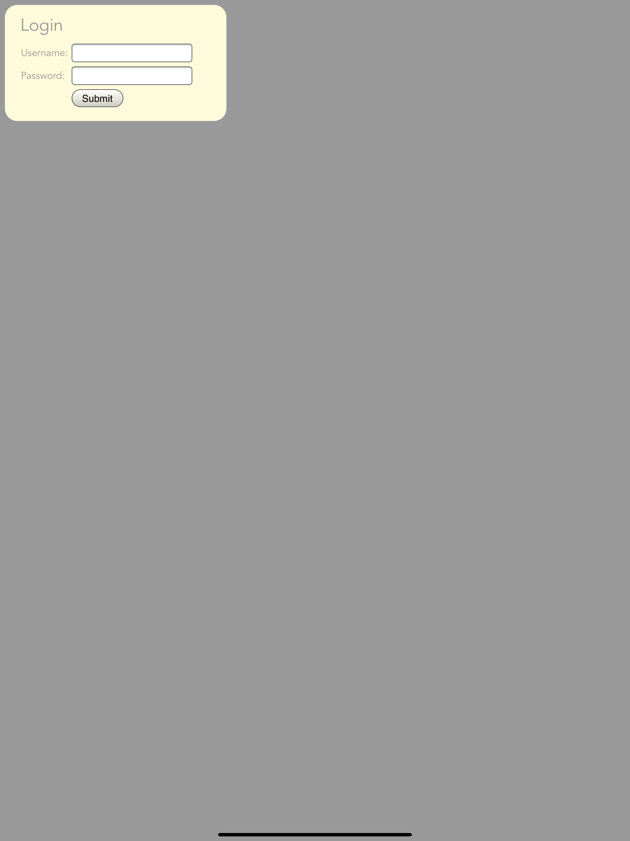
我现在按照建议尝试了以下代码。它仍然仅在第三代iPad Pro 12.9上不起作用。随附iPad模拟器的屏幕截图。登录部分应填满屏幕宽度
/* Landscape*/
@media only screen and (min-device-width: 1366px) and (max-device-height: 1024px) and (-webkit-min-device-pixel-ratio: 2)  and (orientation: landscape)
{
    div.information
    {
        width:1290px;
        padding-left:20px;
        padding-right:20px;
        padding-top:5px;
        padding-bottom:5px;
        border-radius: 20px;
        margin-bottom:10px;
    }
}

/* Portrait*/
@media only screen and (min-device-width: 1024px) and (max-device-height: 1366px) and (-webkit-min-device-pixel-ratio: 2)  and (orientation: portrait)
{
    div.information
    {
        width:950px;
        padding-left:20px;
        padding-right:20px;
        padding-top:5px;
        padding-bottom:5px;
        border-radius: 20px;
        margin-bottom:10px;
    }
}
1 个答案:
答案 0 :(得分:0)
以下查询适用于您。我在声明中添加了定向问题,以指定您握持iPad的方式。另外,您无需使用2个宽度值,而需要将最大值替换为高度值(高度会根据您以横向还是纵向方式握住设备而改变。
/* Landscape*/
@media only screen and (min-device-width: 1366px) and (max-device-height: 1024px) and (-webkit-min-device-pixel-ratio: 2)  and (orientation: landscape)  {}

/* Portrait*/
@media only screen and (min-device-width: 1024px) and (max-device-height: 1366px) and (-webkit-min-device-pixel-ratio: 2)  and (orientation: portrait)  {}
相关问题
最新问题
- 我写了这段代码,但我无法理解我的错误
- 我无法从一个代码实例的列表中删除 None 值,但我可以在另一个实例中。为什么它适用于一个细分市场而不适用于另一个细分市场?
- 是否有可能使 loadstring 不可能等于打印?卢阿
- java中的random.expovariate()
- Appscript 通过会议在 Google 日历中发送电子邮件和创建活动
- 为什么我的 Onclick 箭头功能在 React 中不起作用?
- 在此代码中是否有使用“this”的替代方法?
- 在 SQL Server 和 PostgreSQL 上查询,我如何从第一个表获得第二个表的可视化
- 每千个数字得到
- 更新了城市边界 KML 文件的来源?