倾斜容器内的矩形大小
是否有任何方法或计算方法可以找出transform: skew();容器的块大小?
这是我想要实现的:

到目前为止,我一直在尝试和尝试错误,但是正如您所看到的那样,它不是动态的,有时甚至比边缘还要短。
body,
html {
  width: 100vw;
  height: 100vh;
  position: relative;
}

.container {
  position: absolute;
  top: 50%;
  left: 50%;
  transform: translate(-50%, -50%) skew(-20deg);
  background: lime;
  width: 50%;
  height: 50%;
}

.child {
  position: absolute;
  top: 50%;
  left: 50%;
  transform: translate(-50%, -50%) skew(20deg);
  height: 100%;
  width: 81%;
  background: pink;
  opacity: 0.5
}
<div class="container">
<div class="child"></div>
</div>
2 个答案:
答案 0 :(得分:0)
它与您所要求的结构不完全相同,但是相似,不需要任何复杂的计算。
原理是不要让孩子陷入歪斜的块中,而要放在绝对位置的上方。
因此,我们将堆叠3个相同大小的集团。
如果向后倾斜两个块,则只能得到一半的三角形。要获得完整的三角形,您可以玩transform-origin,并可以实现以下目标:
body,
html {
width: 100vw;
height: 100vh;
position: relative;
}
.container {
position: absolute;
top: 50%;
left: 50%;
transform: translate(-50%, -50%);
background: pink;
width: 50%;
height: 50%;
opacity:0.7;
}
.container-l,
.container-r {
position: absolute;
top: 50%;
left: 50%;
transform: translate(-50%, -50%) skew(-20deg);
transform-origin:50% 0%;
width: 50%;
height: 50%;
}
.container-l {
transform-origin:50% 100%;
background: lime;
}
.container-r {
transform-origin:50% 0%;
background: green;
}<div class="container-r">
</div>
<div class="container-l">
</div>
<div class="container">
  <div class="child"></div>
</div>
答案 1 :(得分:0)
首先,让我们将宽度保持为100%,并简单地调整转换的原点以使其具有此宽度:
body,
html {
  width: 100vw;
  height: 100vh;
  position: relative;
}

.container {
  position: absolute;
  top: 50%;
  left: 50%;
  transform: translate(-50%, -50%) skew(-20deg);
  background: lime;
  width: 50%;
  height: 50%;
}

.child {
  position: absolute;
  top: 50%;
  left: 50%;
  transform: translate(-50%, -50%) skew(20deg);
  transform-origin:top left;
  height: 100%;
  width: 100%;
  background: pink;
  opacity: 0.5
}
<div class="container">
<div class="child"></div>
</div>
现在我们需要删除的部分是红色的部分,如下所示:
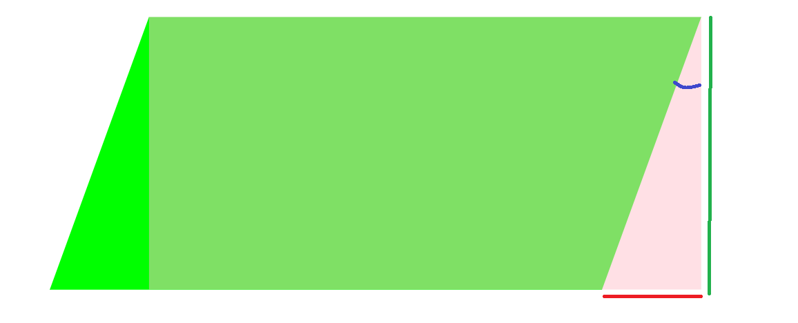
考虑到插图,我们有tan(angle) = X/H,其中angle是偏斜角(20deg),H是高度,X是我们要寻找的。因此,我们需要删除H*tan(20deg) = 0.36369*H:
body,
html {
  width: 100vw;
  height: 100vh;
  position: relative;
}

.container {
  position: absolute;
  top: 50%;
  left: 50%;
  transform: translate(-50%, -50%) skew(-20deg);
  background: lime;
  width: 50%;
  height: 50%;
}

.child {
  position: absolute;
  top: 50%;
  left: 50%;
  transform: translate(-50%, -50%) skew(20deg);
  transform-origin:top left;
  height: 100%;
  width: calc(100% - 0.3639*50vh);
  background: pink;
  opacity: 0.5
}
<div class="container">
<div class="child"></div>
</div>
现在我们已经有了足够的宽度,我们可以调整位置:
body,
html {
  width: 100vw;
  height: 100vh;
  position: relative;
}

.container {
  position: absolute;
  top: 50%;
  left: 50%;
  transform: translate(-50%, -50%) skew(-20deg);
  background: lime;
  width: 50%;
  height: 50%;
}

.child {
  position: absolute;
  top: 0;
  left: 0;
  transform: skew(20deg);
  transform-origin:top left;
  height: 100%;
  width: calc(100% - 0.3639*50vh);
  background: pink;
  opacity: 0.5
}
<div class="container">
<div class="child"></div>
</div>
我不太确定这种形状的用途,但这是在不进行复杂计算的情况下创建该形状的另一种想法:
body,
html {
  width: 100vw;
  height: 100vh;
  position: relative;
}

.container {
  position: absolute;
  top: 50%;
  left: 50%;
  transform: translate(-50%, -50%);
  background:
    linear-gradient(to bottom right,transparent 49.8%,lime 50%) left/15% 100%,
    linear-gradient(to top    left ,transparent 49.8%,lime 50%) right/15% 100%,
    linear-gradient(lime,lime) center/70% 100%;
  background-repeat:no-repeat;
  width: 50%;
  height: 50%;
}

.child {;
  height: 100%;
  width:70%;
  margin:auto;
  background: pink;
  opacity: 0.5
}
<div class="container">
<div class="child"></div>
</div>
您只需要使内部矩形的宽度与居中渐变相同(在这种情况下为70%),然后将剩余的分割成左/右渐变即可创建三角形。
您还可以轻松应用一些动画:
body,
html {
  margin:0;
}

.container {
  position: absolute;
  top: 50%;
  left: 50%;
  transform: translate(-50%, -50%);
  background:
    linear-gradient(to bottom right,transparent 49.8%,lime 50%) left/15% 100%,
    linear-gradient(to top    left ,transparent 49.8%,lime 50%) right/15% 100%,
    linear-gradient(lime,lime) center/70% 100%;
  background-repeat:no-repeat;
  width: 50%;
  height: 50%;
  transition:1s;
}

.child {;
  height: 100%;
  width:70%;
  margin:auto;
  background: pink;
  opacity: 0.5;
  transition:1s;
}

.container:hover {
  background-size:0% 100%,0% 100%,100% 100%;
}

.container:hover .child{
  width:100%;
}
<div class="container">
<div class="child"></div>
</div>
相关问题
最新问题
- 我写了这段代码,但我无法理解我的错误
- 我无法从一个代码实例的列表中删除 None 值,但我可以在另一个实例中。为什么它适用于一个细分市场而不适用于另一个细分市场?
- 是否有可能使 loadstring 不可能等于打印?卢阿
- java中的random.expovariate()
- Appscript 通过会议在 Google 日历中发送电子邮件和创建活动
- 为什么我的 Onclick 箭头功能在 React 中不起作用?
- 在此代码中是否有使用“this”的替代方法?
- 在 SQL Server 和 PostgreSQL 上查询,我如何从第一个表获得第二个表的可视化
- 每千个数字得到
- 更新了城市边界 KML 文件的来源?