在不使用CSS剪切路径的情况下设置iframe的包装div的样式
我想为CSS的剪切路径找到一个替代品,以确保跨浏览器与以下问题的Internet Explorer,Edge和Safari浏览器兼容。
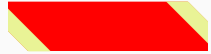
以下示例显示了我想做的事情,一个包装在样式div中且边框大小可变的iframe组件:

我能够在切出的角上使用旋转的正方形在某种程度上使用剪切路径来复制这种样式,并通过剪切路径移除了“多余的”正方形,如您在组件的下图中所示:
当我在Internet Edge中测试此组件时会出现问题,因为后者不支持剪切路径,因此正方形永远不会被剪切,并且看起来像这样:
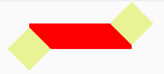
由于您可以验证我的样式化包装器与原始示例甚至都不相似,因此它也不在所有浏览器中都适用...
因此,我要求我提供一些指导,以使该样式的div包装器在所有浏览器中均受支持,并且与原始示例有些相似。
我已经阅读了:before和:after div组合可以完成的操作,但这不能完全包装iframe组件。另外,由于前者的原因,我已经阅读了有关svg屏蔽的信息。
感谢您的帮助。
.preview {
  width: calc(100vw / 20);
  height: calc(100vh / 10);
  background: rgba(83, 80, 131, 0.5);
  cursor: pointer;
  clip-path: polygon( 10px 0%, 100% 0%, 100% 0%, 100% calc(100% - 10px), calc(100% - 10px) 100%, 0% 100%, 0% 100%, 0% 10px);
}

.border-corner {
  transition: all 0.2s ease-in;
  background: #e9f396;
  transform: rotate(45deg);
  bottom: -15;
  right: -15;
  width: 30px;
  height: 30px;
  position: absolute;
}
<div class="preview center">
<img class="image" src="https://static.independent.co.uk/s3fs-public/thumbnails/image/2017/09/12/11/naturo-monkey-selfie.jpg?w968" />
</div>
<div class="border-corner"></div>
2 个答案:
答案 0 :(得分:1)
您可以在使用多个背景设置样式的iframe上考虑伪元素:
.box {
  display:inline-block;
  background:blue;
  position:relative;
}
.box:before {
  content:"";
  position:absolute;
  top:20px;
  left:20px;
  bottom:20px;
  right:20px;
  background:
   /*top left corner*/
    linear-gradient(to top left    ,transparent 49.8%,blue 50%) top left/30px 30px,
    linear-gradient(to top left    ,transparent 49.8%,grey 50%) top left/37px 37px,
    /*bottom right corner*/
    linear-gradient(to bottom right,transparent 49.8%,blue 50%) bottom right/30px 30px,
    linear-gradient(to bottom right,transparent 49.8%,grey 50%) bottom right/50px 50px,

    /*borders*/
    linear-gradient(grey,grey) top    /100% 5px,
    linear-gradient(grey,grey) bottom /100% 5px,
    linear-gradient(grey,grey) right  /5px 100%,
    linear-gradient(grey,grey) left   /5px 100%;
  background-repeat:no-repeat;
}

iframe {
  display:block;
  margin:20px;
  background:red;
  border:none;
}
<div class="box">
<iframe scr=""></iframe>
</div>
答案 1 :(得分:1)
如果可以使用mask,则可以获得仅CSS的解决方案。请注意:不包括 IE 10和IE 11,并且仅在Edge 18+(部分)中工作。
但是,如果没有clip-path或mask,我非常怀疑您会找到一种解决方案,该解决方案使它在每个浏览器中看起来都相同 ,同时还允许您查看其中的内容背景(假设您希望该元素通过绝对定位或类似方法“浮动”)。对于不支持的浏览器,也许您应该考虑使用“简单”框。
.shape {
  position: relative;
  width: 200px;
  height: 200px;
  background: #c00;
  box-shadow: 0 0 0 5px #000 inset;
  overflow: hidden;
  -webkit-mask: url("data:image/svg+xml,%3Csvg xmlns='http://www.w3.org/2000/svg' width='47' height='49'%3E%3Cpath d='M11.23 0L0 11.23V49h35.77L47 37.77V0H11.23z'/%3E%3C/svg%3E") 0 0/200px 200px;
  mask: url("data:image/svg+xml,%3Csvg xmlns='http://www.w3.org/2000/svg' width='47' height='49'%3E%3Cpath d='M11.23 0L0 11.23V49h35.77L47 37.77V0H11.23z'/%3E%3C/svg%3E") 0 0/200px 200px;
}

.shape:before,
.shape:after {
  content: '';
  display: block;
  position: absolute;
}

.shape:before {
  top: 0;
  left: 0;
  border-style: solid;
  border-width: 55px 55px 0 0;
  border-color: #000 transparent transparent transparent;
}

.shape:after {
  bottom: 0;
  right: 0;
  border-style: solid;
  border-width: 0 0 70px 70px;
  border-color: transparent transparent #000 transparent;
}


.shape_content {
  display: block;
  width: 100%;
  height: 100%;
  border: 0 none;
}
<div class="shape">
<iframe src="#foo" class="shape_content"></iframe>
</div>
相关问题
最新问题
- 我写了这段代码,但我无法理解我的错误
- 我无法从一个代码实例的列表中删除 None 值,但我可以在另一个实例中。为什么它适用于一个细分市场而不适用于另一个细分市场?
- 是否有可能使 loadstring 不可能等于打印?卢阿
- java中的random.expovariate()
- Appscript 通过会议在 Google 日历中发送电子邮件和创建活动
- 为什么我的 Onclick 箭头功能在 React 中不起作用?
- 在此代码中是否有使用“this”的替代方法?
- 在 SQL Server 和 PostgreSQL 上查询,我如何从第一个表获得第二个表的可视化
- 每千个数字得到
- 更新了城市边界 KML 文件的来源?