How do I fix the cross browser compatibility for my CSS Grid Layout?
I have successfully created a CSS Grid layout. However, now I want to add support or a fallback for non or poorly supported browsers, specifically IE11.
I have added browser prefixes and read a million articles about adding floats, etc. I created a block of code that should work, but I cannot for the life of me get it to render when testing on IE11 (I have a Mac laptop with no access to a PC).
// sass-lint:disable no-important no-vendor-prefixes no-duplicate-properties final-newline

// Grid Variables
$cols: 12 !default;
$gutter: 50px !default;

// Breakpoints
$lg: 1199.98px;
$md: 991.98px;
$sm: 767.98px;
$xs: 575.98px;

$breakpoints: (
  (l, $lg, 100%, 1),
  (m, $md, 100%, 2),
  (s, $sm, 100%, 2),
  (x, $xs, 100%, 3),
  (no, 0, 100%, 3)
) !default;

// Typography
$font-size: 20px;
$font-family: 'BrokenEn', serif;
$line-height: 1.4;

// Animations
$grid-animation: all .15s ease-in-out;
$grid-animation-slow: all .3s ease-in-out;

// Globals

*,
*::after,
*::before {
  backface-visibility: hidden;
}

html {
  box-sizing: border-box;
  margin: 0;
  overscroll-behavior: none;
  padding: 0;
}

body {
  background-color: #fff;
  border: 0;
  box-sizing: inherit;
  color: #000;
  font: normal 1rem $font-family;
  height: 100%;
  left: 0;
  line-height: 1;
  margin: 0;
  overflow-x: hidden;
  padding: 0;
  position: relative;
}

// Grid
header,
main,
footer {
  background-color: #f5f5dc;
  width: 100%;
}

.r {
  -ms-grid-columns: 1fr 1fr 1fr 1fr 1fr 1fr 1fr 1fr 1fr 1fr 1fr 1fr;
  background-color: #7fffd4;
  display: -ms-grid !important;
  display: grid !important;
  grid-gap: $gutter;
  grid-template-columns: repeat($cols, 1fr);
  position: relative;
  transition: $grid-animation;
}

[class*='c-'] {
  -ms-grid-column-span: $cols;
  background-color: #faebd7;
  grid-column: span $cols;
  position: relative;

  &.nest {
    -ms-grid-columns: 1fr 1fr 1fr 1fr 1fr 1fr 1fr 1fr 1fr 1fr 1fr 1fr;
    background-color: #7fffd4;
    display: -ms-grid !important;
    display: grid !important;
    grid-gap: $gutter;
    grid-template-columns: repeat($cols, 1fr);
    position: relative;
  }

  &.contain-auto {
    margin-left: $gutter;
    margin-right: $gutter;
  }

  &.contain-fixed {
    margin-left: auto;
    margin-right: auto;
    width: $lg;
  }
}

.col-wrap {
  display: inline-block;
  padding: 0 $gutter;
  width: 100%;
}

.no-c-gap {
  grid-column-gap: 0 !important;
}

@for $i from 1 through $cols {
  .c-#{$i} {
    -ms-grid-column-span: $i;
    grid-column: span $i;
  }
}

@each $name, $size, $container, $divide in $breakpoints {
  @media only screen and (max-width: $size) {
    .r {
      grid-gap: $gutter / $divide;
    }

    [class*='c-'] {
      &.nest {
        grid-gap: $gutter / $divide;
      }

      &.contain-auto {
        margin-left: $gutter / $divide;
        margin-right: $gutter / $divide;
      }
    }

    @for $i from 1 through $cols {
      .#{$name}#{$i} {
        -ms-grid-column-span: $i;
        grid-column: span $i;
      }
    }
  }
}

@supports not (display: grid) {
  .r {
    display: inline-block !important;
    width: 100% !important;

    ::after {
      content: ' ';
      display: block;
      width: 100%;
    }

    [class*='c-'] {
      display: block !important;
      float: left !important;
      margin: 0 $gutter $gutter 0;
    }
  }

  @for $i from 1 through $cols {
    .c-#{$i} {
      width: calc((100% / #{$cols} * #{$i}) - #{$gutter}) !important;
    }
  }

  @each $name, $size, $container, $divide in $breakpoints {
    @media only screen and (max-width: $size) {
      @for $i from 1 through $cols {
        .#{$name}#{$i} {
          width: calc((100% / #{$cols} * #{$i}) - #{$gutter}) !important;
        }
      }
    }
  }
}

// If @support not supported by browser.
@media all and (-ms-high-contrast: active), (-ms-high-contrast: none) {
  .r {
    display: inline-block !important;
    width: 100% !important;

    ::after {
      content: ' ';
      display: block;
      width: 100%;
    }

    [class*='c-'] {
      display: block !important;
      float: left !important;
      margin: 0 $gutter $gutter 0;
    }
  }

  @for $i from 1 through $cols {
    .c-#{$i} {
      width: calc((100% / #{$cols} * #{$i}) - #{$gutter}) !important;
    }
  }

  @each $name, $size, $container, $divide in $breakpoints {
    @media only screen and (max-width: $size) {
      @for $i from 1 through $cols {
        .#{$name}#{$i} {
          width: calc((100% / #{$cols} * #{$i}) - #{$gutter}) !important;
        }
      }
    }
  }
}
Could someone help me look over the code and tell me how I can (1) better my grid, (2) get the "@supports not (display: grid)" code to work in IE11?
EDIT:
This would be an example of how it looks in all modern browsers, and how I would want it to look after the IE fallback kicks-in.
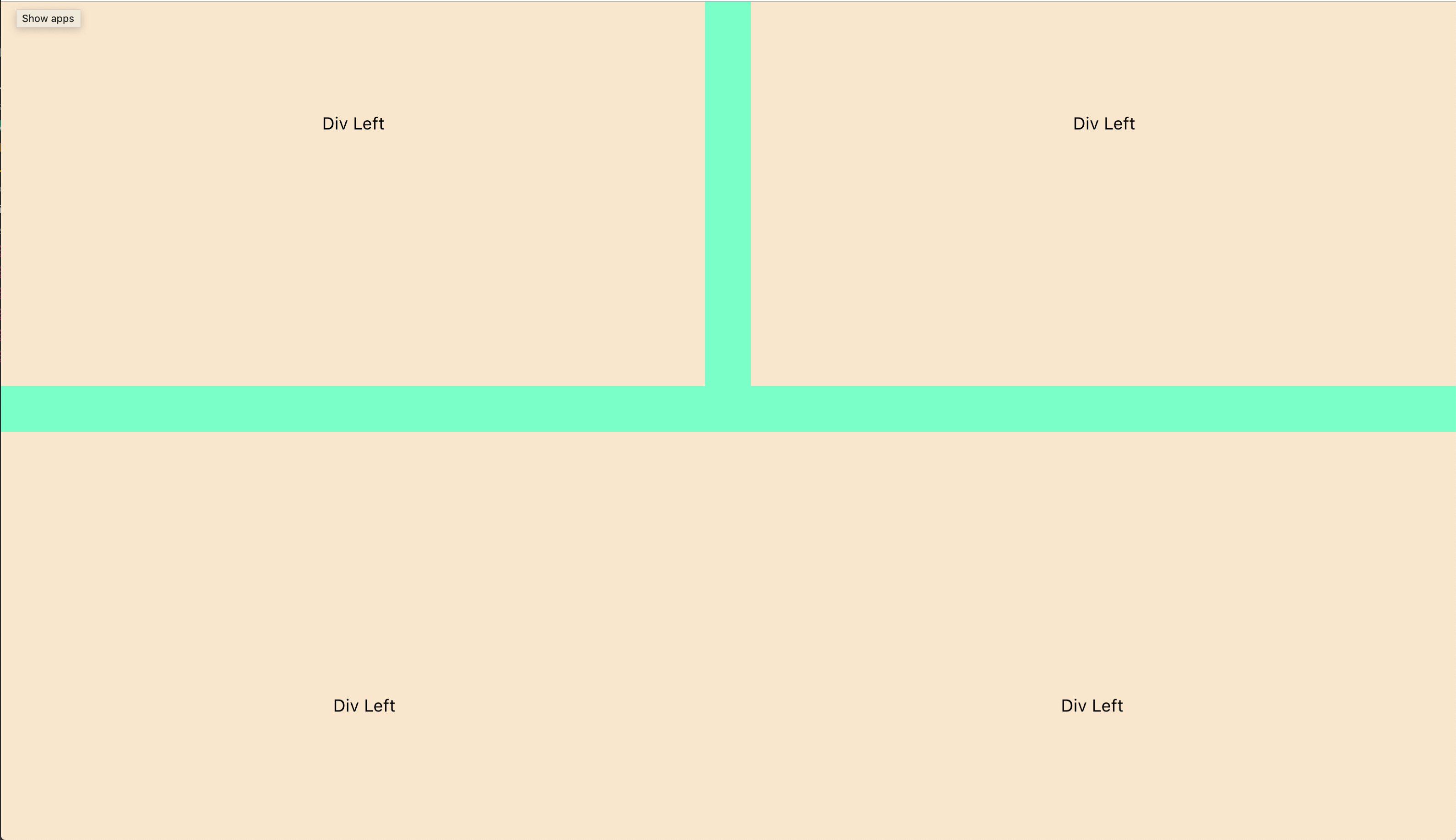
<body>
    <header class="r">Header</header>
    <main class="r">
        <section class="c-12 nest ratio-4-3">
            <div class="c-6">
                <div class="wrap">Div Left</div>
            </div>
            <div class="c-6">
                <div class="wrap">Div Left</div>
            </div>
        </section>
        <section class="c-12 nest no-c-gap ratio-4-3">
            <div class="c-6">
                <div class="wrap">Div Left</div>
            </div>
            <div class="c-6">
                <div class="wrap">Div Left</div>
            </div>
        </section>
    </main>
    <footer class="r">Footer</footer>
</body>
1 个答案:
答案 0 :(得分:1)
@supportsisn't supported in IE So you have to put code in there for browsers that DO support grid. It should override your NON-Grid code. (remove the "not").Grid is only partly supported in IE so you're likely better off using a polyfill for support over the partial options in the browser.
If you need to do a lot of cross-browser testing, look into a tool like BrowserStack.
Edit: to suggest a course of action.
I suggest this approach.
Re-write everything using a layout technique other than CSS Grid. People have been making cross-browser, performant, responsive layouts for years without grid. This will likely work across ALL your target browsers. If at this point, you get something better by using CSS Grid, use it as progressive enhancement.
The reason, I suggest this is a different layout technique might require additional containers/wrappers forcing your markup to change. It will be difficult to add these in, only "when grid won't work".
- 我写了这段代码,但我无法理解我的错误
- 我无法从一个代码实例的列表中删除 None 值,但我可以在另一个实例中。为什么它适用于一个细分市场而不适用于另一个细分市场?
- 是否有可能使 loadstring 不可能等于打印?卢阿
- java中的random.expovariate()
- Appscript 通过会议在 Google 日历中发送电子邮件和创建活动
- 为什么我的 Onclick 箭头功能在 React 中不起作用?
- 在此代码中是否有使用“this”的替代方法?
- 在 SQL Server 和 PostgreSQL 上查询,我如何从第一个表获得第二个表的可视化
- 每千个数字得到
- 更新了城市边界 KML 文件的来源?