使用`grid-template-columns:之字形顺序:repeat(auto-fit,minmax(10em,1fr));`
我想使用CSS网格以Z字形顺序排列一系列HTML兄弟姐妹。每个兄弟姐妹都应具有相同的大小,并且网格应使用自动布局,例如grid-template-columns: repeat( auto-fit, minmax(250px, 1fr))。
我尝试过这种自动布局:
#div1 {
  display:grid;
  grid-gap:10px;
  margin:30px;
  grid-template-columns: repeat( auto-fit, minmax(250px, 1fr) );
  grid-template-rows: repeat(3, auto);
  grid-auto-flow: column;
}
#div1 > DIV {
  padding: 30px;
  color: white;
  background: blue;
}
<div id="div1">
<div>1</div>
<div>2</div>
<div>3</div>
<div>4</div>
<div>5</div>
<div>6</div>
<div>7</div>
<div>8</div>
<div>9</div>
<div>10</div>
<div>11</div>
<div>12</div>
</div>
我想实现绿色布局,但获得红色布局。
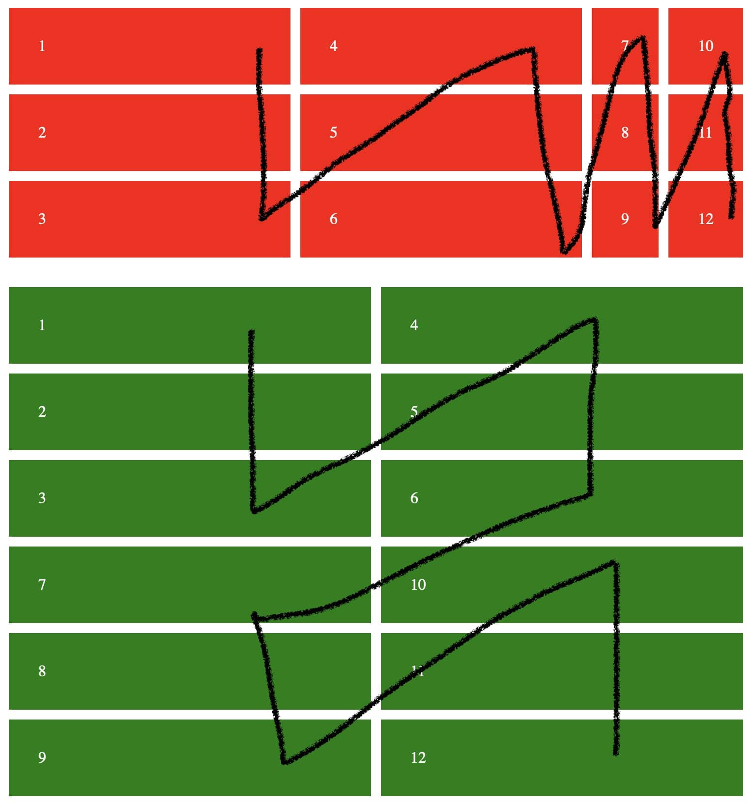
请注意,红色布局中的单元格大小不同,并且不会自动换行以创建新的行集。
所需布局的ASCII艺术,可自动适应视口的宽度,例如:
 1  4
 2  5
 3  6
 7 10
 8 11
 9 12
etc
 1  4  7
 2  5  8
 3  6  9
10 13 16
11 14 17
12 15 18
 1  4  7 10
 2  5  8 11
 3  6  9 12
13 16
14 17
15 18
 1  4  7 10 13
 2  5  8 11 14
 3  6  9 12 15
16
17
18
约束:
- 我无法更改HTML
- 自动布局应创建尽可能多的相等宽度的列。
0 个答案:
没有答案
相关问题
最新问题
- 我写了这段代码,但我无法理解我的错误
- 我无法从一个代码实例的列表中删除 None 值,但我可以在另一个实例中。为什么它适用于一个细分市场而不适用于另一个细分市场?
- 是否有可能使 loadstring 不可能等于打印?卢阿
- java中的random.expovariate()
- Appscript 通过会议在 Google 日历中发送电子邮件和创建活动
- 为什么我的 Onclick 箭头功能在 React 中不起作用?
- 在此代码中是否有使用“this”的替代方法?
- 在 SQL Server 和 PostgreSQL 上查询,我如何从第一个表获得第二个表的可视化
- 每千个数字得到
- 更新了城市边界 KML 文件的来源?