如何并排渲染组件
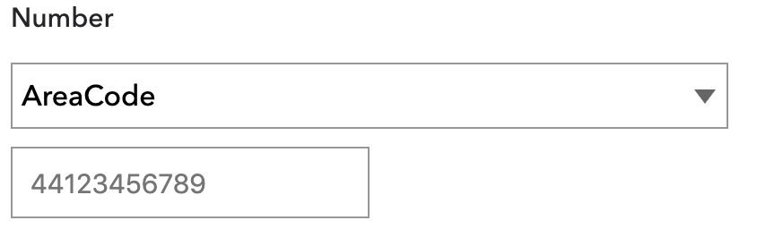
我有以下输出:
 这是render方法中的代码:
return (
  <div>
    <div>
      <TextMedium fontSize="15px" text="Number" />
      <Select options={[{ label: 'AreaCode', value: 'AreaCode' }]} />
    </div>
    <div>
      <TInput placeholder={daytimePhoneNumber} />
    </div>
  </div>
);
它由自定义组件组成。我正在尝试对它们进行样式设置,以使它们并排放置,并且TextMedium组件应占据一半的空间,剩余空间应在两个组件之间平均分配。.本质上是TextMedium的50%,Select和Select的25% TInput。
我尝试过样式设置,但似乎没有任何效果。
3 个答案:
答案 0 :(得分:0)
您可以使用bootstrap进行布局对齐或设置外部div {display:flex; flex-direction:row;}的样式,
return (
  <div style={display:flex; flex-direction:row;}>
    <div>
      <TextMedium fontSize="15px" text="Number" />
      <Select options={[{ label: 'AreaCode', value: 'AreaCode' }]} />
    </div>
    <div>
      <TInput placeholder={daytimePhoneNumber} />
    </div>
  </div>
);
答案 1 :(得分:0)
使用弹性布局,如下所示:
  return (
    <Container
      style={{
        display: 'flex'
      }}>
      <Text
        style={{
          width: '50%'
        }}
      />
      <Select
        style={{
          width: '25%'
        }}
      />
      <Input
        style={{
          width: '25%'
        }}
      />
    </Container>
  );
答案 2 :(得分:0)
您可以使用display: 'flex'和flexDirection: 'row' CSS选项在行中显示div。这是在行中显示控件的示例代码。
<div style={{
      display: 'flex',
      flexDirection: 'row',
      width: '100%',
      backgroundColor: 'lightGrey',
    }}>
      <div style={{ width: '50%' }}>
        <label style={{width: '100%'}}>Number</label>
      </div>
      <div style={{ width: '25%' }}>
        <select style={{width: '100%'}}>
          <option value="AreaCode">AreaCode</option>
        </select>
      </div>
      <div style={{ width: '25%' }}>
        <input style={{width: '100%'}} type="text" value="2343434" />
      </div>
    </div>
工作代码和框here
相关问题
最新问题
- 我写了这段代码,但我无法理解我的错误
- 我无法从一个代码实例的列表中删除 None 值,但我可以在另一个实例中。为什么它适用于一个细分市场而不适用于另一个细分市场?
- 是否有可能使 loadstring 不可能等于打印?卢阿
- java中的random.expovariate()
- Appscript 通过会议在 Google 日历中发送电子邮件和创建活动
- 为什么我的 Onclick 箭头功能在 React 中不起作用?
- 在此代码中是否有使用“this”的替代方法?
- 在 SQL Server 和 PostgreSQL 上查询,我如何从第一个表获得第二个表的可视化
- 每千个数字得到
- 更新了城市边界 KML 文件的来源?